This is no portfolio. It is a showcase of projects and work I'm proud of.
No case studies. Just some context on how I tick, what I think, and how I approach friction. And maybe one or two icebreakers for when we meet.
Because, you know, I'm really bad at small talk.
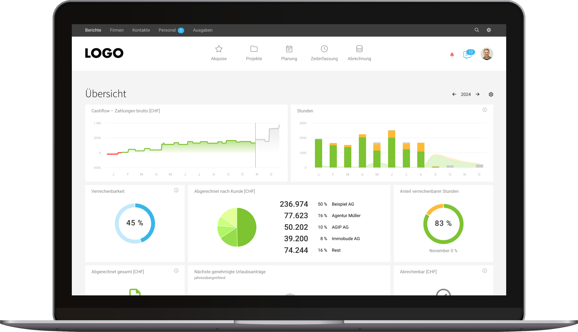
Keeping an ERP SaaS simple is a full-time job. Literally.
MOCO serves over 7 000 agencies, IT service providers, and consultancies as central hub for their project business. It touches everything: time tracking, billing, reporting, budgets, planning. The pull toward complexity is constant.
My job as lead product designer is to resist that pull. With a default 'no' and deliberate decisions, I keep MOCO focused and effective across its entire lifecycle — from support and specs to implementation and communication.
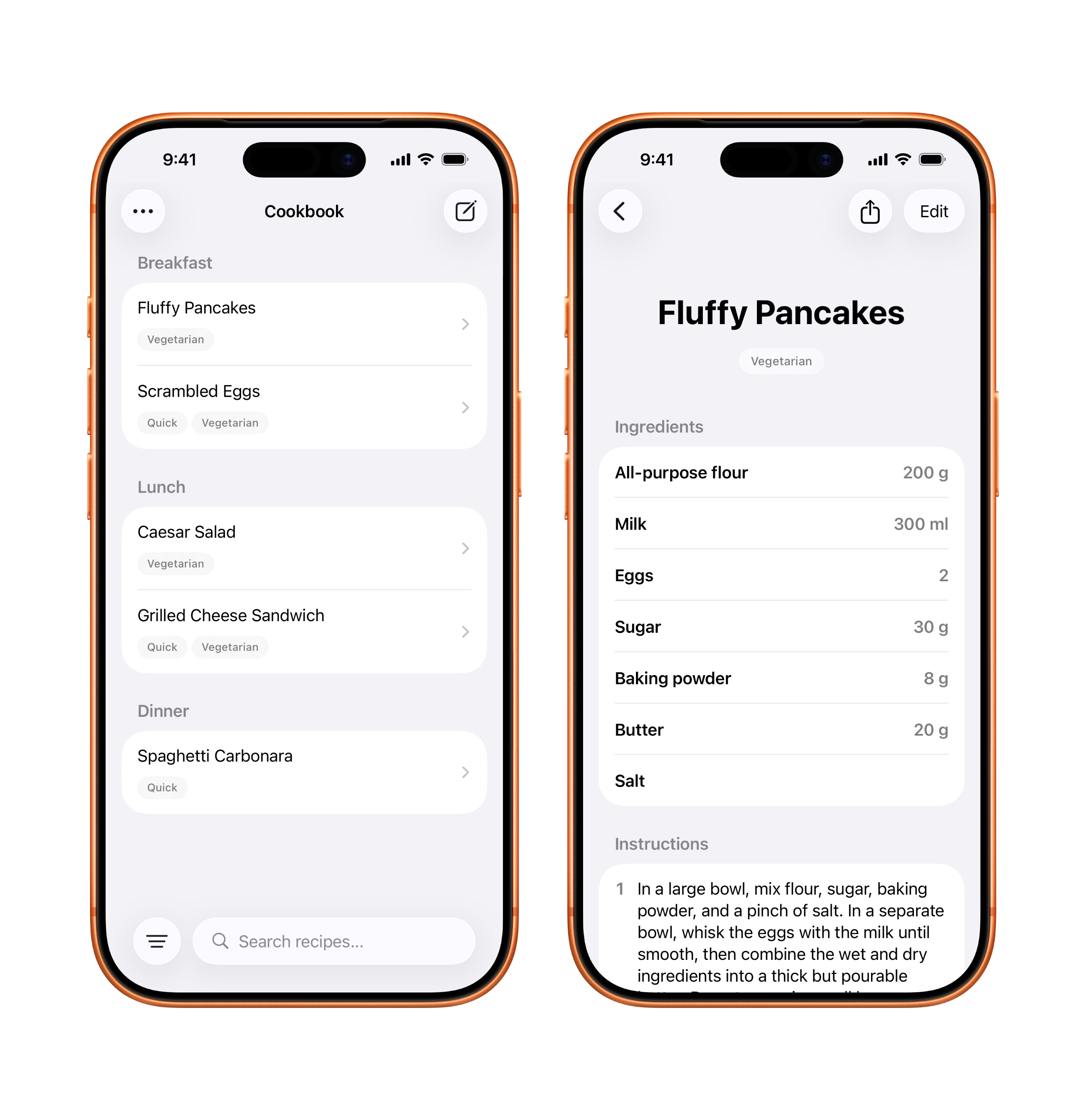
A minimal iOS app to manage personal recipes.
Cooking runs in my family. I wanted a better way to keep our family recipes organized, but existing solutions were cluttered with ads and noise. So I built my own.
Dead Simple Cookbook is intentionally simple—no photos, no grocery list, no social feed. Only the recipes, categories, tags, and fast search. So I can stay focused on what I enjoy.
I shipped the SwiftUI app with the help of Claude and learned a ton about iOS development and vibe coding along the way.
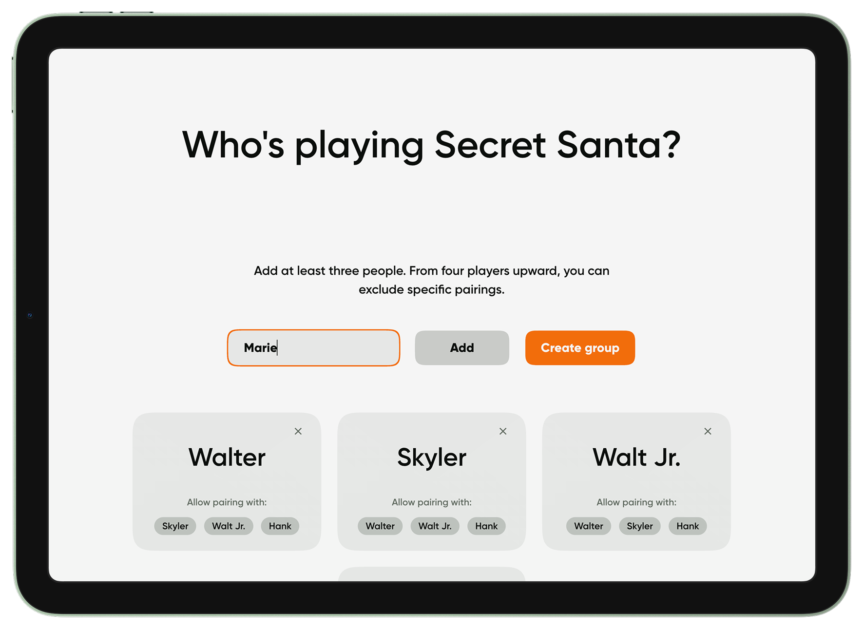
Play Secret Santa without paying with your data.
My Secret Santa group is spread across cities, and it got more and more complicated to avoid gifting the same person. The classic tiny-paper lottery wasn’t pulling it off anymore. Existing online tools were out for my data.
So I built a tiny web app for exactly that: draw names remotely and handle exclusions comfortably. Create a group, share the link, and let everyone draw their name. Or play locally on a single device.
No accounts, no ads, no tracking. Just play. Give it a shot!
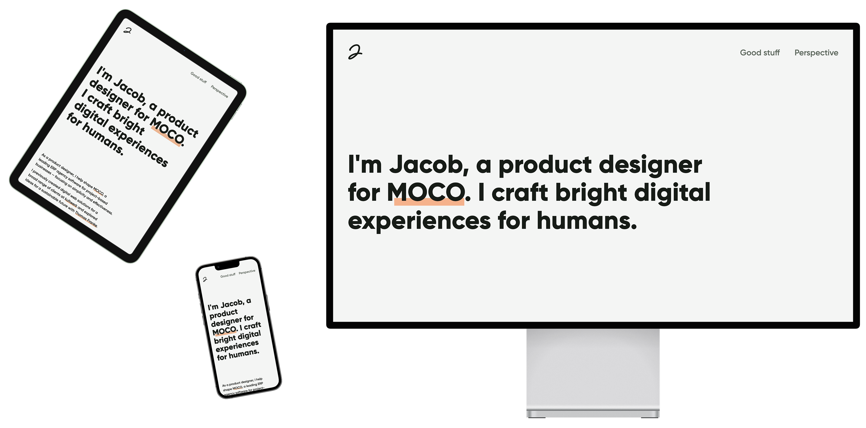
My personal website is my simplicity playground.
I regularly experiment with my personal website and its offshoots, tweaking details and challenging what I’ve done before. It’s my sandbox for layout, typography, and copy—walking the thin line between minimalism and aesthetics.
Most recently, I tried a fluid design with as few lines of code as possible. No framework, no libraries—just plain HTML and CSS for full control, performance, and simplicity.
A small, hand‑coded counterweight in an age of generic AI.
Experience design doesn't end at the edge of the screen.
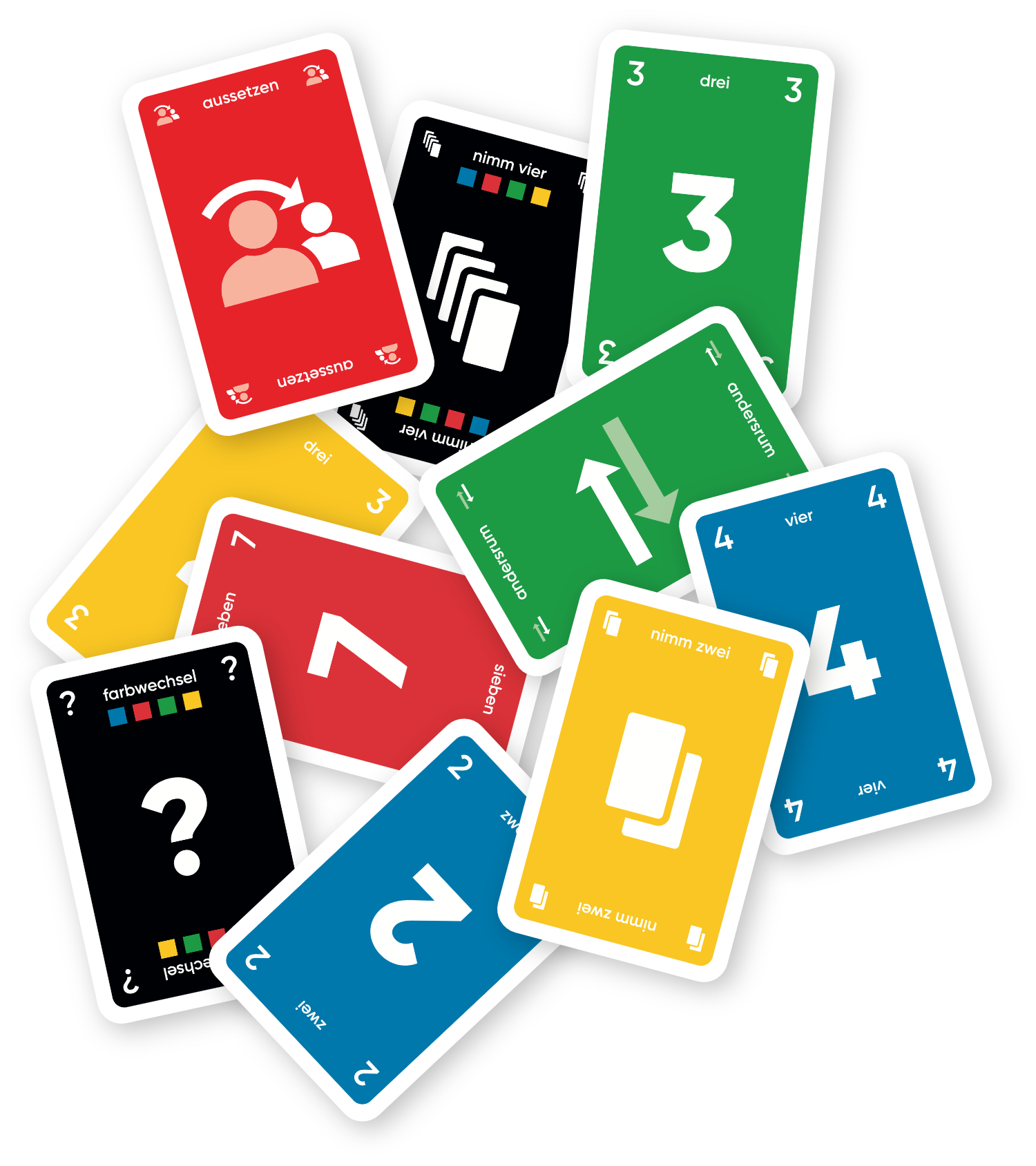
Even in trivial things, I try to remove friction. The UNO card game is a phenomenon—easy to learn, always fun—but its design is stuck in the past.
I created and produced a new set with vibrant, easy-to-distinguish colors. Values in all corners allow fanning out cards left and right, and written numbers support faster recognition.
Add a few house rules, and you’re all set. Do you dare to play a game with me? Your turn!

Pen and paper at the gym. There has to be a better way.
My strength training at Kieser came with a low‑tech burden: machine settings and weights lived on a paper sheet I had to update manually after each exercise. I wanted a less disruptive way to track my progress.
The Kieser Fit concept pairs an Apple Watch app that shows settings and guides each set with an iPhone app for reviewing progress and adjusting routines. No more fumbling between exercises. Just a glance, tap, and move on.
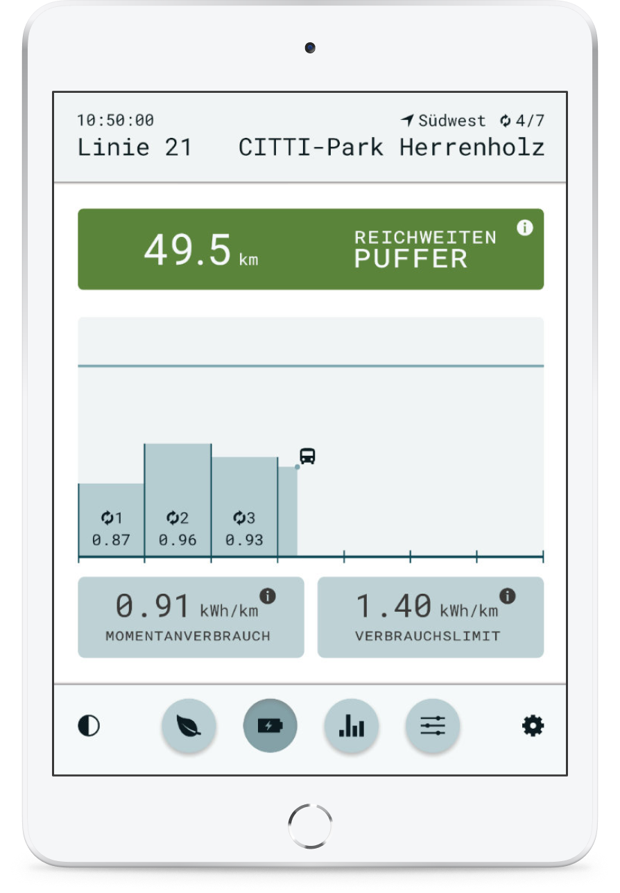
Making range anxiety tangible and actionable for drivers of electric buses.
Electric bus drivers had no reliable way to judge remaining range. To avoid getting stranded, vehicles returned too early to the depot, making them economically inefficient.
For my master thesis, I designed and built a modular web app that translated complex consumption data into focused, glanceable widgets. Full human‑centered design process — research, concept, prototyping, and field testing in actual public buses. The goal: help drivers build accurate mental models of range dynamics.
It was my first end‑to‑end product, and where I first realized: the hard part is not the data. It's finding the right shape for it.